 T
T


WEBSITE & LOGO BRAND DEVELOPMENT
Axil Creations is a premium Logo Design company in Kathmandu, Nepal , which specializes in professional custom Company logo designs and Corporate Identity Solutions. Axil Creations a logo design company, we understand how critical your Corporate logo or Company logo is to the success of your business. Our professional and talented logo designers produce customized corporate identity solutions, while always keeping in mind your requirements.

WEBSITE DESIGN & MOBILE APPS DEVELOPMENT
Axil Creations is a premium Logo Design company in Kathmandu, Nepal , which specializes in professional custom Company logo designs and Corporate Identity Solutions. Axil Creations a logo design company, we understand how critical your Corporate logo or Company logo is to the success of your business. Our professional and talented logo designers produce customized corporate identity solutions, while always keeping in mind your requirements.

GRAPHICS/ LOGO/ BROCHURE DESIGN
Axil Creations Solutions is a brochure Design company offering various Brochure design services like Tri-Fold Brochure, Design Booklet Design, Pocket Folder Design, Presentation Folder Design,Single Fold Brochure, Gate Fold Brochures, Map Fold Design, Flyer and Leaflet Design, Rack Card Design, Spec Sheet Design, Sell Sheet Design, Product Sheet Design. Brochures Designing are an important part of your overall marketing plan.

ABOUT AXIL CREATIONS WEBSITE, GRAPHICS, LOGO
Axil Creations is a professional web design, website development and graphic designing company providing a full range of web & graphic design services including high-class web site development, flash design, custom web programming from a simple web page to the complex solutions, corporate identity design (including logo, graphic and business cards), e-commerce solutions and Content Management Systems.
Website Design
Print Design
Logo design
 WordPress customization and integration
 Magento customization and integration
 Joomla customization and integration
 Mobile Apps Development in Different Platform
Responsive Web Design
FULLY
responsive
Webdesign
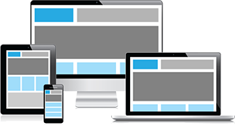
Responsive Web design (RWD) is a Web design approach aimed at crafting sites to provide an optimal viewing experience-easy reading and navigation with a minimum of resizing, panning, and scrolling-across a wide range of devices (from mobile phones to desktop computer monitors). A site designed with RWD adapts the layout to the viewing environment by using fluid, proportion-based grids, flexible images, and CSS3 media queries, an extension of the @media rule. The fluid grid concept calls for page element sizing to be in relative units like percentages, rather than absolute units like pixels or points. Flexible images are also sized in relative units, so as to prevent them from displaying outside their containing element. Media queries allow the page to use different CSS style rules based on characteristics of the device the site is being displayed on, most commonly the width of the browser
Offshore Outsourcing Website Design at Reasonable and Affordable Price

What Our Client Says
I will strongly recommend Axil Creations to anyone, at any time, for any project – period.” Mr. Manoj Kedia - CEO Kedia Organisation (P) Ltd. http://www.kediaorganisation.com View All Testimonials


